Introducing the Next Chapter of the CCA/ACC Brand
The Canadian Camps Association / Association des camps du Canada has always been more than a national organization. It is a network of people, places, and shared values, shaped by generations of camp leaders, strengthened by provincial associations, and rooted in the life-changing experiences that happen at camp.
As our sector continues to evolve, so too must the way we present ourselves.
Today, we are proud to introduce the refreshed visual identity for the Canadian Camps Association / Association des camps du Canada - designed to honour our history, reflect the bilingual nature of our membership, and represent the modern, professional, and connected national organization we are today.
This rebrand is not a departure from our past. It is a continuation of it.
It builds on the momentum of CCA/ACC’s long history while giving our Association a visual identity that is clear, flexible, professional, and ready to support the work ahead.
Honouring the History of the CCA Logo
The story of the CCA/ACC logo stretches back more than seven decades.
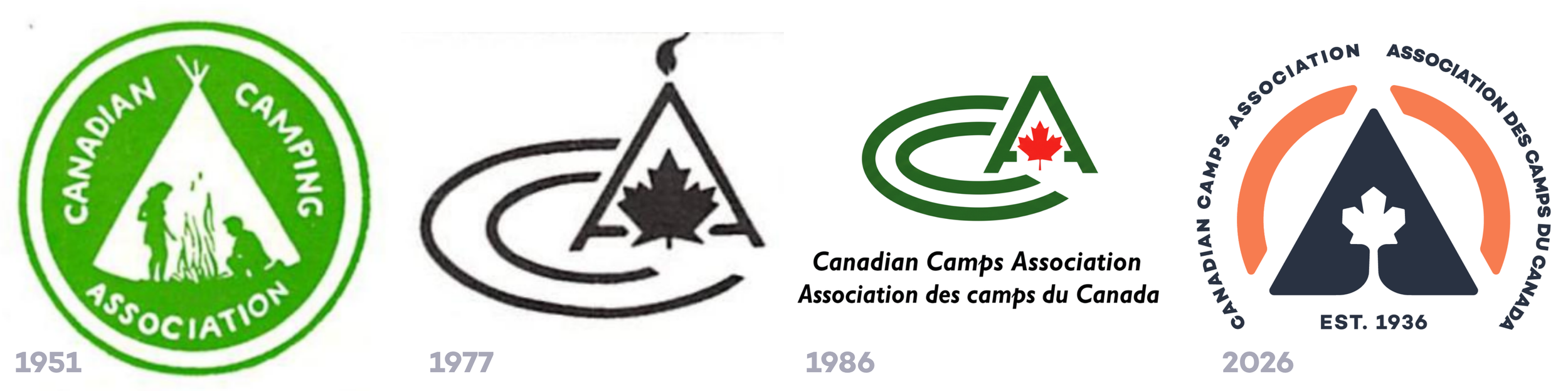
One of the earliest known visual identities of the Association was the green crest, which first appeared in Canadian Camping Magazine in 1951. It was designed by Mr. D. P. Bromley of Toronto through Art Buckley and the Public Relations Committee. Circular in form, with a tent, campfire, and figures gathered outdoors, the crest reflected the spirit of camping in Canada at that time: community, nature, simplicity, and shared experience.
In 1977, a new black-and-white logo was introduced. Designed by Daphne Kaye of Camp Voyageur in South River, Ontario, this mark brought forward a more modern graphic expression. It featured a strong “C” form paired with an “A,” a maple leaf, and a flame above the tent-like structure. The design created a memorable national symbol that connected camp, Canada, and the Association in a simple visual mark.
Around 1986, the logo evolved again, with the flame above the “A” removed. This updated version continued to serve the Association for many years, becoming familiar to camps across the country as a symbol of connection to the national camp community.
Most recently, in 2025, the Association changed the word “Camping” to “Camps.” This was an important language shift. While “camping” can suggest recreational camping, CCA/ACC represents a broader and more specialized sector: summer camps, overnight camps, day camps, outdoor education centres, and the many organizations that create intentional, developmental camp experiences for children, youth, families, and communities.
Each version of the logo has reflected the Association at a particular moment in time. Each carried forward core ideas: a connection to the outdoors, a national identity, and a commitment to the camp experience.
Our new brand honours that lineage while preparing CCA/ACC for its next chapter.
A New Identity Built From Familiar Symbols
The refreshed logo preserves the spirit of what has come before while presenting it in a stronger, more balanced, and more enduring form.
At the centre of the mark is a custom-drawn maple leaf, created specifically for the Canadian Camps Association / Association des camps du Canada. It is paired with a tent silhouette and surrounding arch forms that suggest a sense of gathering. Together, these elements connect Canada, camp, community, and shared experience.
The shape of the mark has been refined for clarity, scalability, and flexibility. It can work across digital platforms, printed materials, signage, apparel, social media, and small-format uses where older or more detailed logos may have been difficult to reproduce clearly.
Importantly, the design was not created to follow a short-term trend. It is built from simple, timeless forms that reflect the Association’s role as a trusted national organization supporting camps across Canada.
The result is a visual identity that feels established and forward-looking at the same time.
Reflecting Our Bilingual National Community

As a national association, CCA/ACC must represent a bilingual membership and a bilingual country.
That was a central consideration in the development of the new logo system.
The primary identity includes both English and French: Canadian Camps Association / Association des camps du Canada. The logo has been designed so that the acronym can be read as either CCA or ACC, recognizing both official-language expressions of the Association.
This bilingual approach is not simply a formatting decision. It is a reflection of who we are.
Our membership includes camps, associations, and leaders working in English, French, and bilingual environments across the country. The new identity helps ensure that our national brand is inclusive, balanced, and representative of the communities we serve.
Why These Colours?
The new colour palette was developed by drawing inspiration directly from Canadian landscapes and camp experiences.
Rather than relying only on expected outdoor-sector colours, the palette reflects the places and moments that make camp meaningful: fiery sunsets, rugged rock, wildflowers, forests, morning mist, fireflies, evening skies, and the warmth of gathering together.
At the foundation is Twilight, a deep, authoritative dark blue that communicates trust, stability, and professionalism. It gives the brand a strong base and reflects the national leadership role of CCA/ACC.
Paired with it is Sunset, a warm orange that brings energy, optimism, and a sense of welcome. It captures the feeling of connection at the heart of camp - the glow of the evening sky, the warmth of community, and the momentum of shared purpose.
The palette allows CCA/ACC to show up with both professionalism and warmth - an important balance for a national association representing a sector built on trust, care, learning, adventure, and belonging.
A Brand for the Modern CCA/ACC
The refreshed brand is designed for where the Association is now - and where we are going.
CCA/ACC continues to play an important leadership role in strengthening the camp sector across Canada. Our work includes advocacy, accreditation, research, national collaboration, member support, and helping tell the story of why camps matter.
As that work grows, our visual identity will support it.
The new brand gives CCA/ACC a consistent and professional presence across communications, events, digital platforms, government relations, public-facing materials, and member resources. It helps position the Association as a credible national voice while still reflecting the warmth, optimism, and connection that define camp.
This is the balance we wanted the new identity to achieve: trusted and welcoming, national and local, professional and human, rooted in history and ready for the future.
What This Means for Camps
For camps and PCA members, the new CCA/ACC brand is more than an updated logo. It is a shared symbol of belonging to a strong national network.
When families see the CCA/ACC logo on your website, in your marketing materials, or alongside your accreditation information, it helps communicate that your camp is connected to a broader community committed to quality, safety, professionalism, and the continued advancement of camp in Canada.
We encourage all member camps and associations to begin using the new CCA/ACC logo moving forward.
Download the CCA/ACC brand assets here.
Moving Forward Together
The CCA/ACC has been shaped by generations of people who believed in the power of the camp experience.
This refreshed brand honours that legacy.
It carries forward the symbols, values, and national spirit that have long been part of CCA/ACC, while giving the Association a visual identity that reflects the professionalism, diversity, and momentum of today’s camp sector.
As we move forward, this brand will help us tell a clearer and stronger story: that camps matter, that our sector is united, and that CCA/ACC is proud to support and represent camps across Canada.
Together, we are building on a strong history and stepping confidently into the next chapter.